
Role:
UX/UI Designer
Tags:
Web Designer
UI
Finbooks is an AI-powered financial tool designed to help users create campaigns more efficiently. The redesign focused on making AI the core of the experience while simplifying the interface and improving user confidence.
Finbooks uses AI to help people understand and manage their finances. The challenge was communicating its value while making key interactions easier to navigate.
I redesigned the experience to simplify messaging, improve visual hierarchy, and reduce friction across key workflows.
The original interface made it difficult to understand the product's value and identify its main actions. Campaign settings and credit information also needed better organization.
Three areas shaped the redesign:
Communicate value faster through clearer messaging.
Make AI capabilities easier to understand and discover.
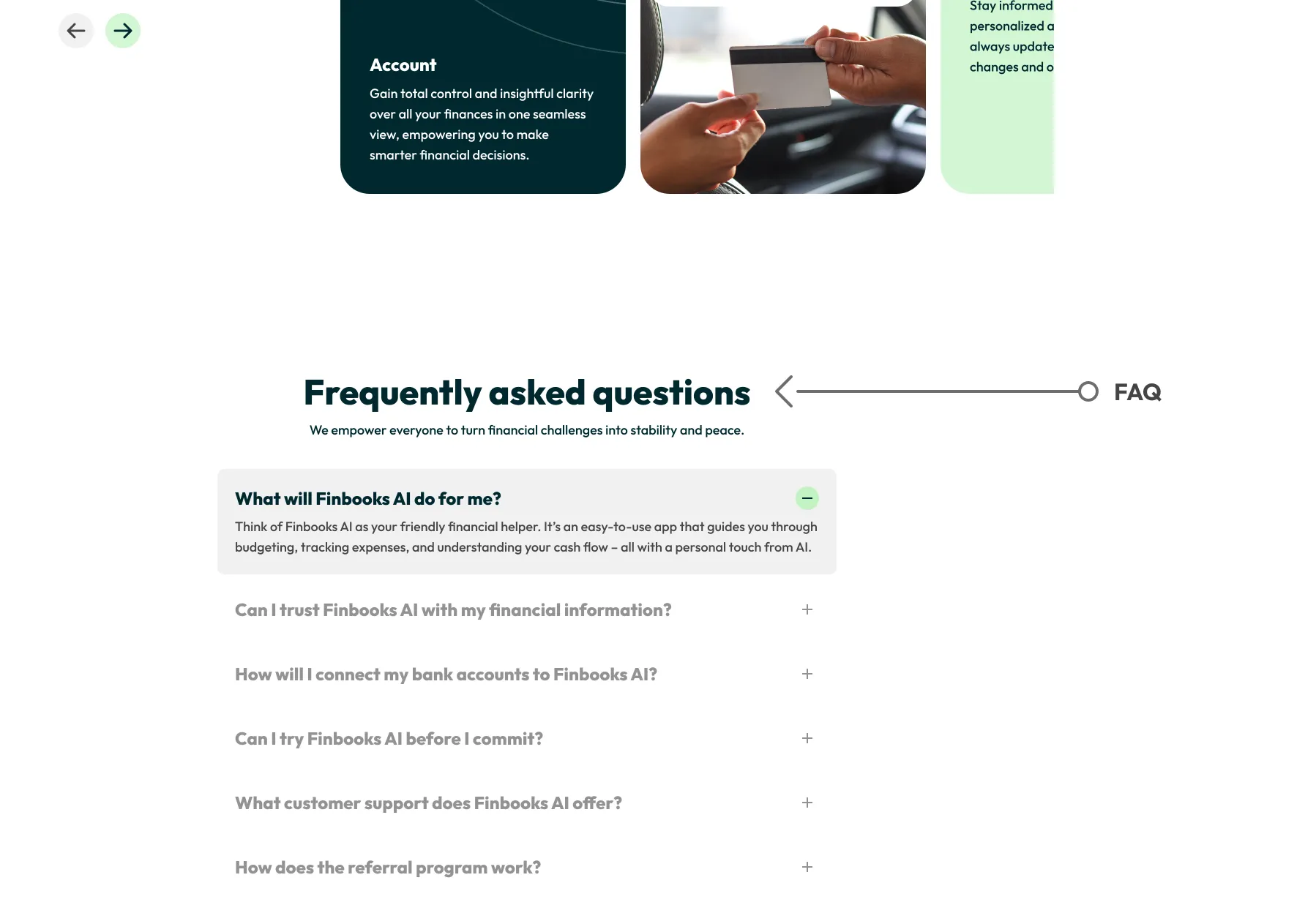
Simplify campaign settings, credit information, and contact.
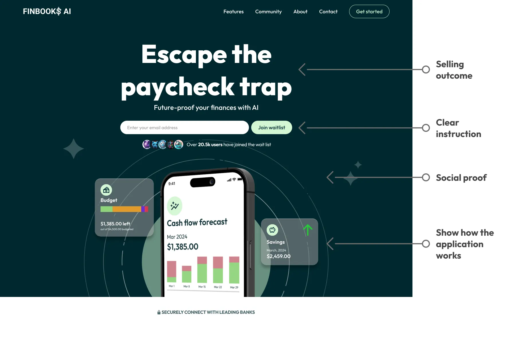
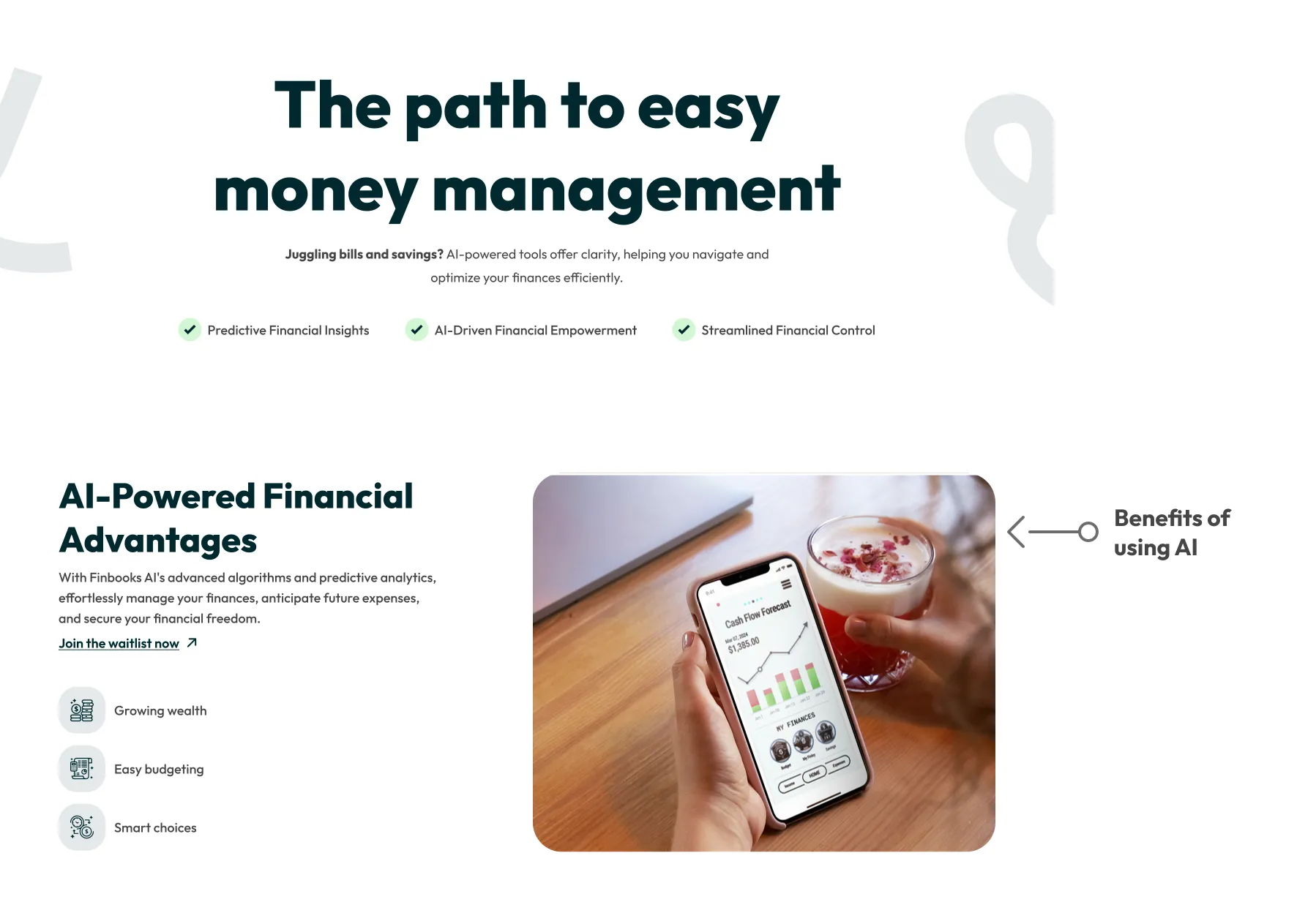
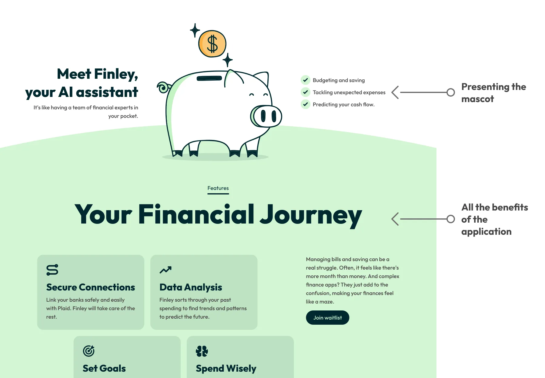
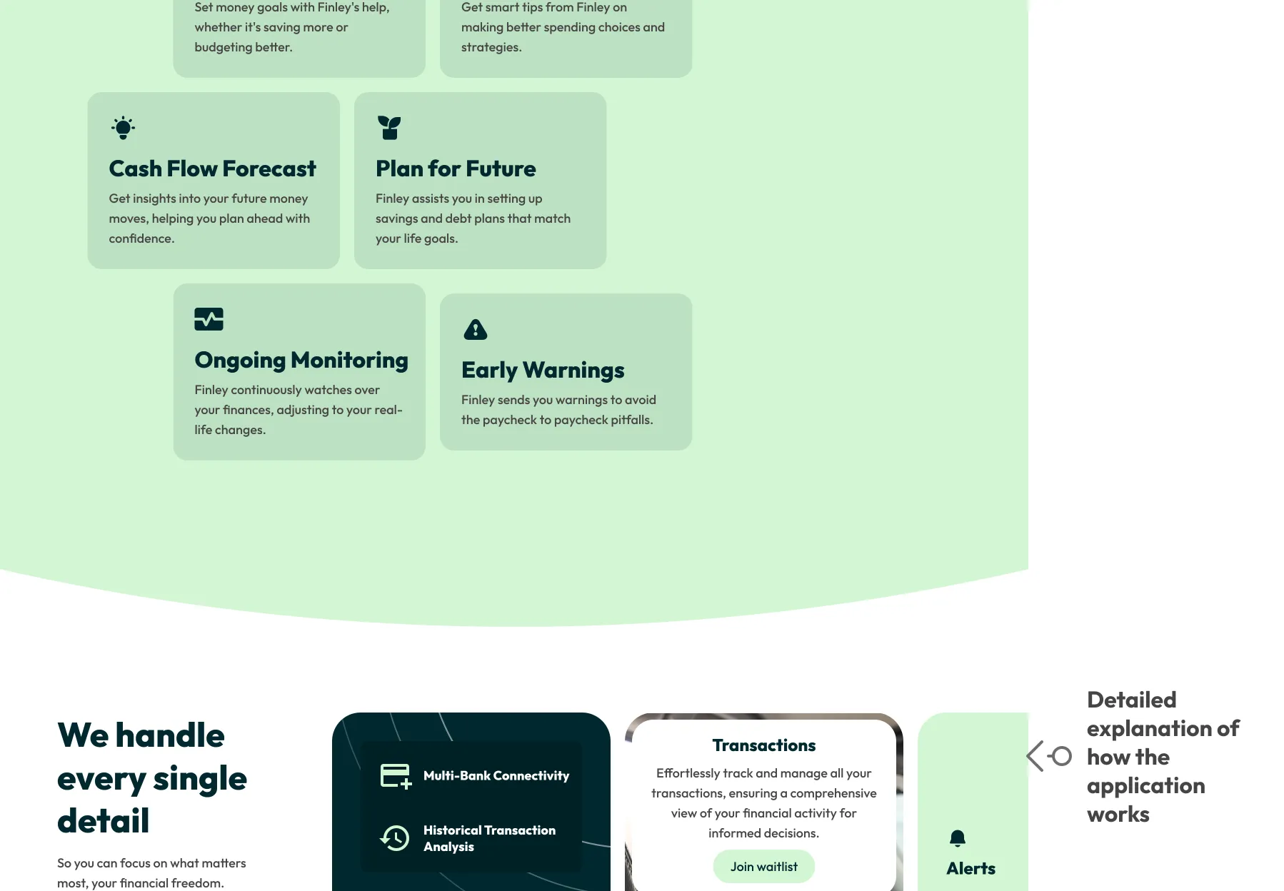
| Theme | Problem | Decision | Why |
|---|---|---|---|
| Simplify campaign creation | Campaign settings felt fragmented. | Group related settings and options together. | Create a more organized, predictable workflow. |
| Improve credit visibility | Available credits and campaign usage lacked visibility. | Give credit information greater prominence. | Help users understand resource usage before committing. |
| Highlight AI capabilities | The product's main differentiator wasn't clear enough. | Give AI functionality a stronger role in content and visual hierarchy. | Show what the technology enables, not just that AI exists. |
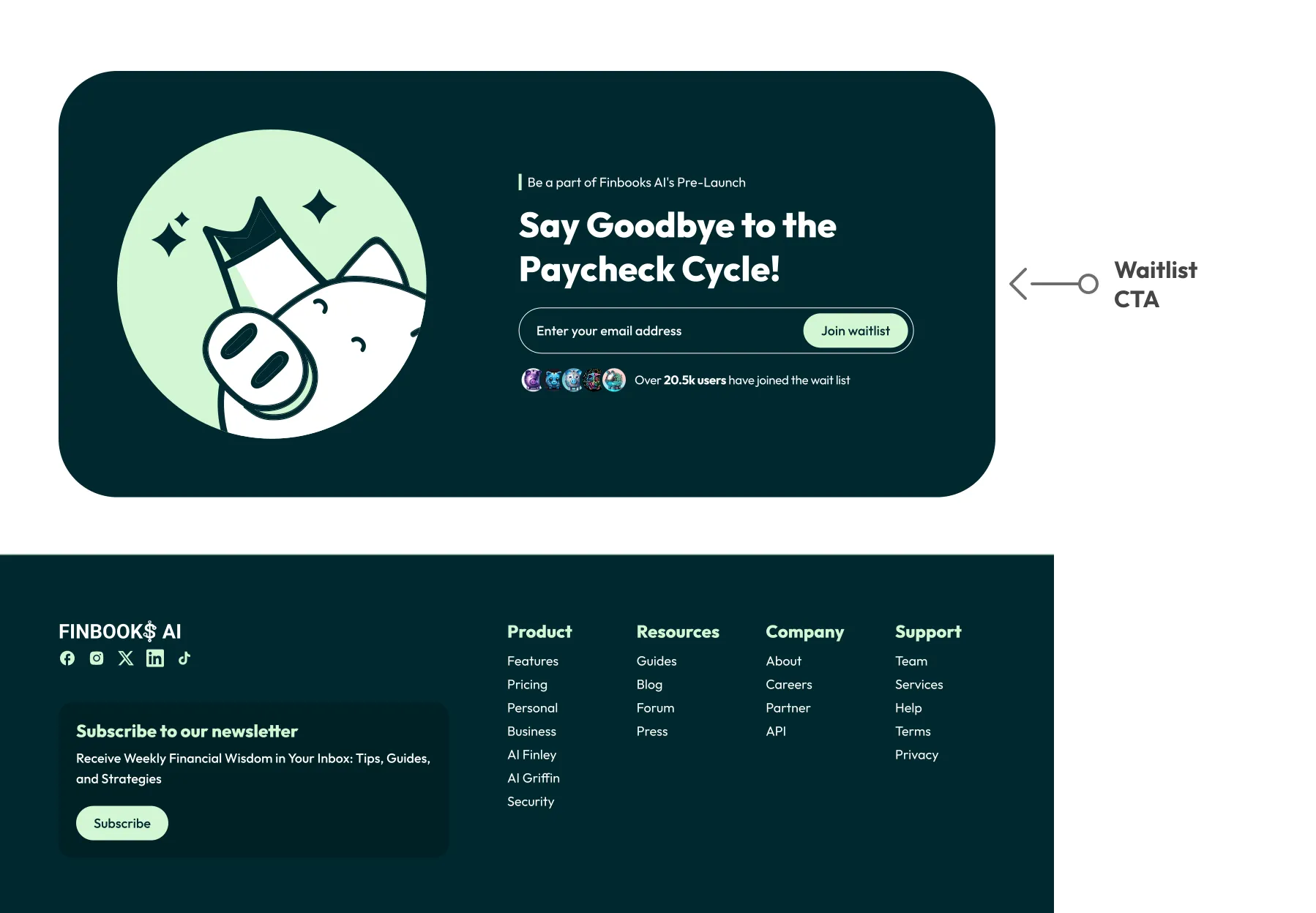
| Strengthen product messaging | The hero section contained too much information. | Use a shorter headline, stronger hierarchy, and clearer CTA. | Help visitors understand the value faster.. |
| Simplify contact | The contact form required too many inputs. | Replace it with a single email field. | Make getting in touch quicker and easier. |
| Reduce visual noise | Competing content made the page harder to scan. | Remove unnecessary text and refine layouts. | Keep attention on product value and key actions |
Direct messaging makes the product's value easier to understand.
AI capabilities become more visible throughout the experience.
Campaign settings and credit information are easier to access.
A shorter contact flow reduces unnecessary steps.
The redesign gave Finbooks a clearer identity and made its AI capabilities easier to understand. Improved content hierarchy, campaign organization, and simplified interactions created a more focused experience.
Core product goals
Design improvements
Unified campaign workflow
Clearer credit overview
Focused value proposition
Simplified contact flow
Designing for AI reinforced the importance of communicating value before complexity. Good UX makes technology understandable through what people can accomplish — not just how advanced it looks.