User Communication
Messaging
UX
Research
Project
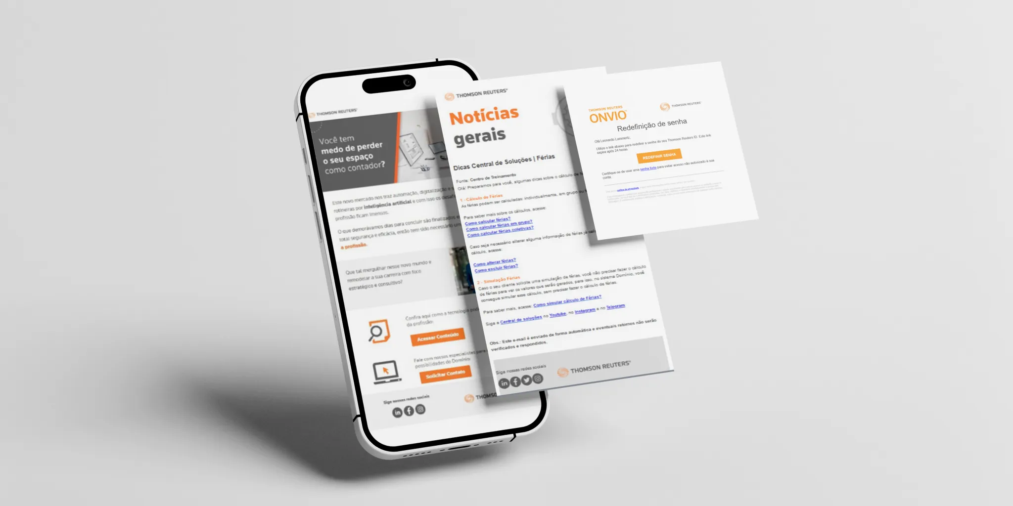
Thomson Reuters had accumulated dozens of fragmented emails and notifications across different teams, creating inconsistent experiences and unnecessary user noise. I helped redesign the communication strategy by auditing existing messages, consolidating content, and creating a scalable email design system.
Impact
- Reduced notifications from 87 → 12
- Saved approximately 349 emails/month across 299 companies
- Created reusable email templates for future communication
Mapping the communication ecosystem
Before redesigning the experience, we needed to understand the scale of the problem. I collaborated with product teams across the platform to audit every existing email and notification, mapping each message to its purpose, audience, and stage in the user journey.
Output
- 87 unique messages identified
- Multiple overlapping communications discovered
- No shared communication standards between teams
Identifying what users actually needed
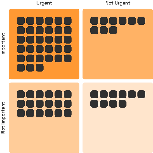
Using the Eisenhower Matrix, we evaluated each communication based on urgency and value. This helped teams identify redundant notifications, merge similar messages, and prioritize communications that genuinely supported user workflows.
Establishing consistency
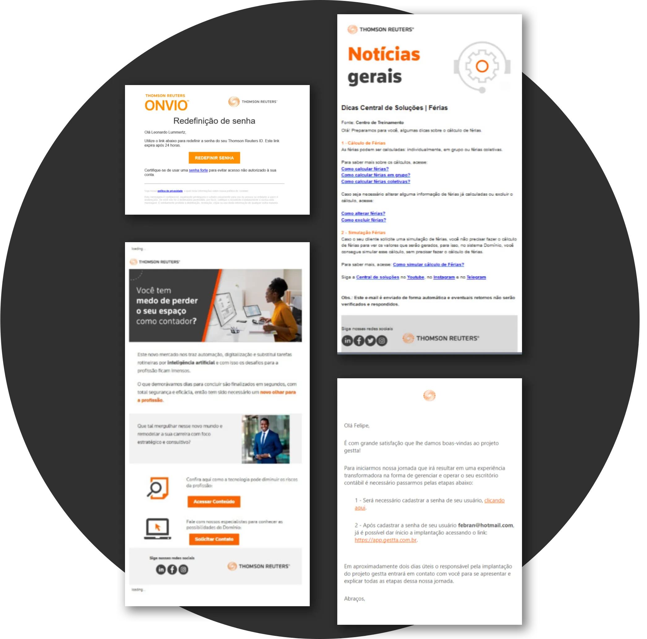
The audit revealed a second challenge: every team had developed its own email style. Without shared patterns or guidelines, communications felt disconnected from the Thomson Reuters product experience.
Reducing noise through content strategy
Based on our findings, we eliminated unnecessary messages, combined overlapping notifications, and rewrote key communications using UX writing principles.
Before
- Multiple emails for a single workflow
- Inconsistent tone and structure
After
- Fewer, clearer messages
- Improved information hierarchy
- More actionable communication
Creating a scalable email design system
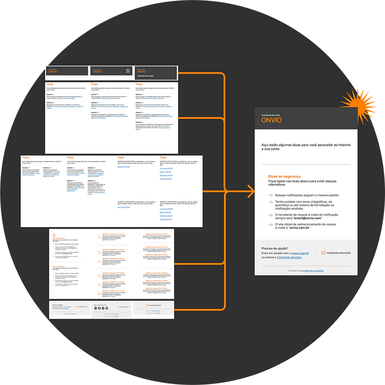
To prevent future inconsistencies, I designed reusable email templates in Figma based on common communication scenarios. These templates gave teams a shared foundation while allowing designers to create new emails faster.
Highlight:
- Modular layouts
- Consistent branding
- Faster future production
Results

Reducing communication overload
Reduced one team's notifications from 87 to 12, resulting in approximately 349 fewer emails per month across 299 companies.

Creating a scalable system
Built reusable Figma templates that improved consistency and simplified future email creation.

Aligning teams around users
Unified teams around communication priorities by focusing on message value, urgency, and user needs.

Designing with purpose
Combined content strategy and visual design to create clearer, more focused user communication.