Medtime
Mobile
Study case
Project
Designing a medication management app that helps users build consistent medication routines with minimal effort.
Medtime is a UX case study exploring how reminders, recurring schedules, and pharmacy recommendations can simplify daily medication management for users with different lifestyles.
Goals
- Reduce the effort required to create medication reminders
- Support recurring and changing treatment schedules
- Help users purchase prescribed medication more easily
Challenge
Medication reminder apps often become overwhelming as treatments grow more complex. Users need to manage recurring medications, multiple daily doses, and changing schedules without spending unnecessary time configuring reminders. The challenge was to create an experience that remained simple for first-time users while providing enough flexibility for more demanding routines.
User Research
Research revealed two primary user groups with different scheduling needs.
| User Group | Primary Need | Pain Point |
|---|---|---|
| 👨🎓 Young Patients | Simple medication reminders | Reminder setup is too complex |
| 🏋️ Busy Professionals | Flexible recurring schedules | Need to recreate schedules every week |
First User Testing
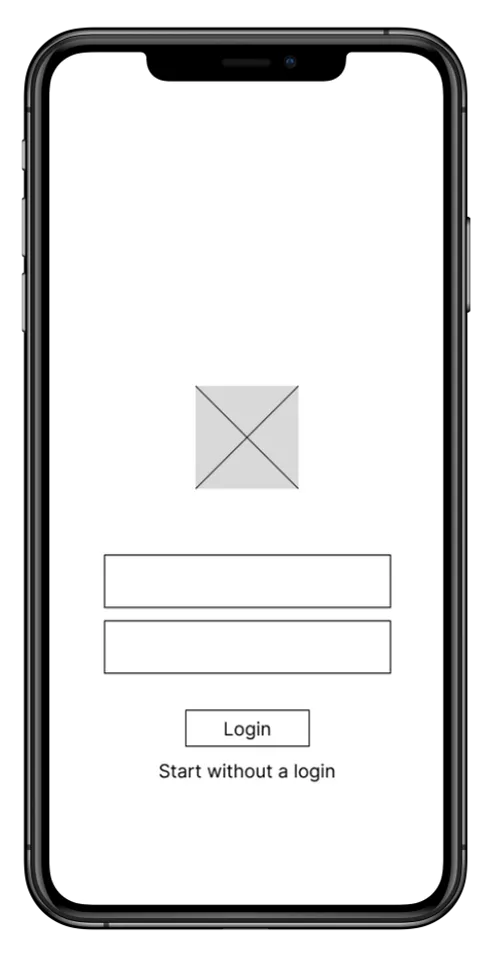
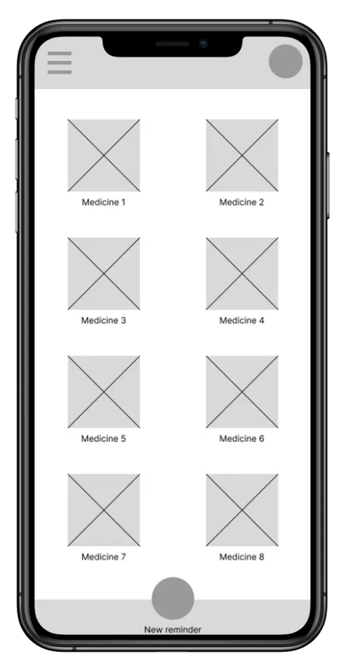
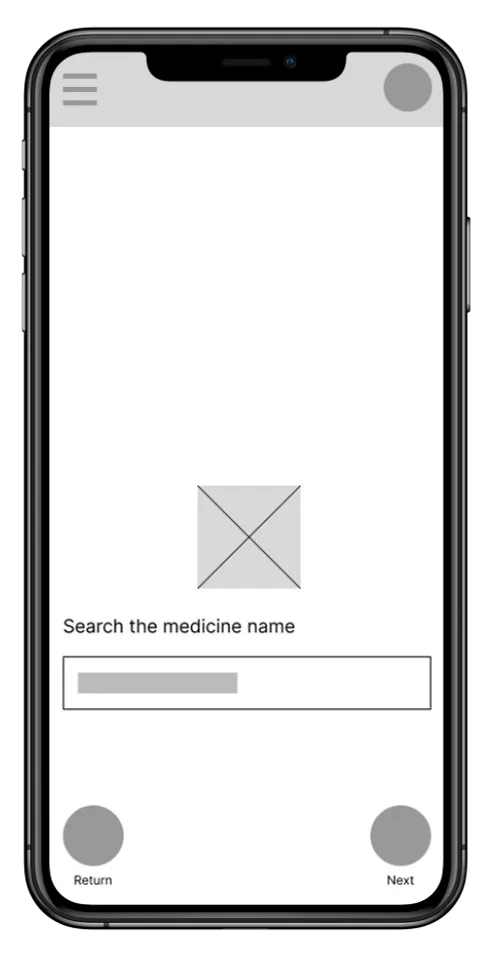
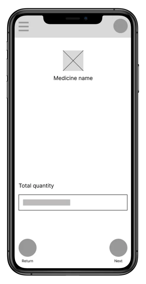
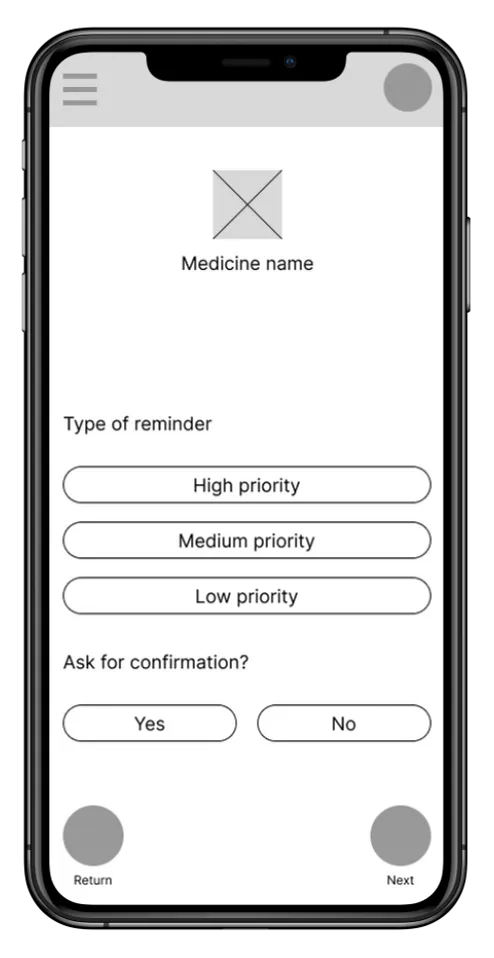
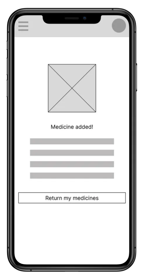
Early usability testing with low-fidelity prototypes revealed friction around recurring medications, multiple daily doses, and schedule customization.

Drag to view all
Refining UX
After the first tests, I carefully analyzed key improvements needed for the screens, identifying areas for refinement to enhance the user experience. Addressing these insights ensured that the next design iterations would result in a more intuitive and user-friendly interface, meeting and exceeding user expectations.
Goals
- Users wanted a dedicated area for recurring medication.
- Creating multiple reminders was too time-consuming.
- Users expected pharmacy recommendations after creating a prescription.
- Different users preferred different calendar layouts.
Hi-Fi Prototype
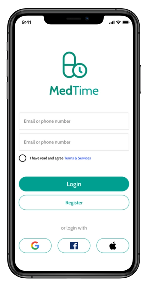
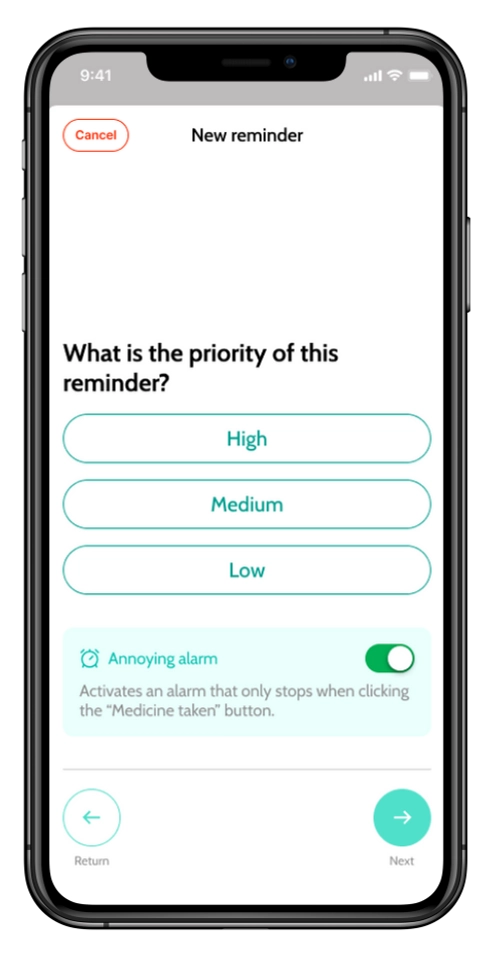
Based on testing, I redesigned the experience to reduce repetitive actions and make medication scheduling feel more natural.
Drag to view all
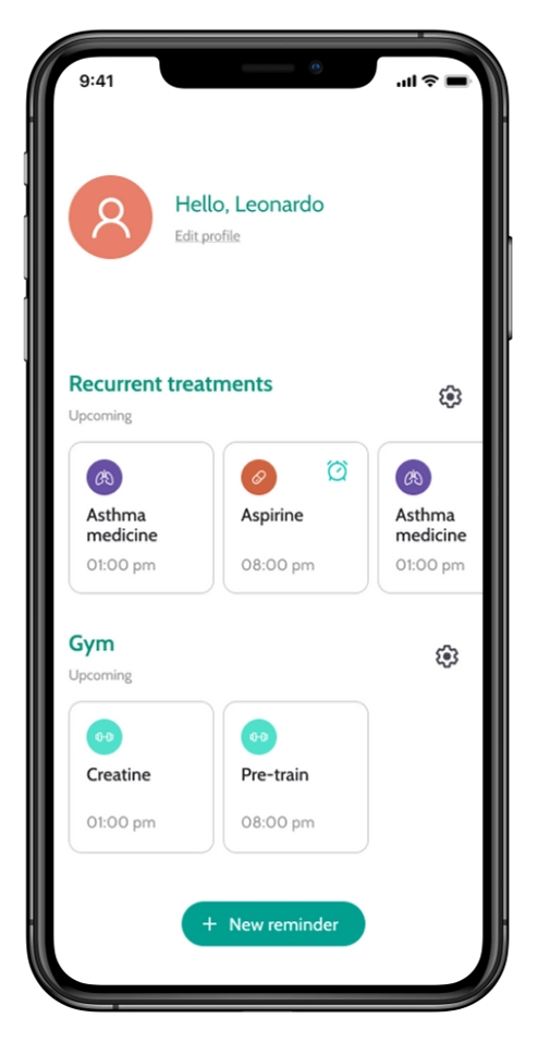
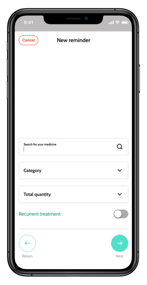
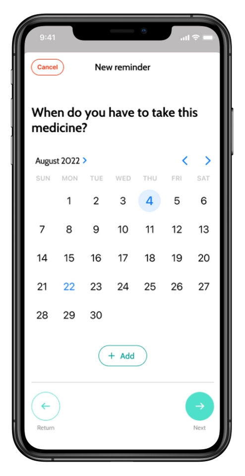
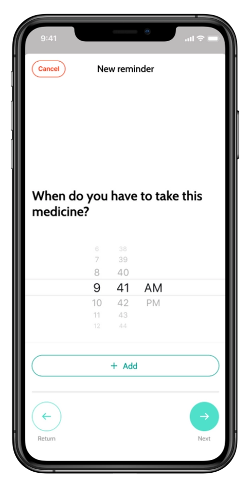
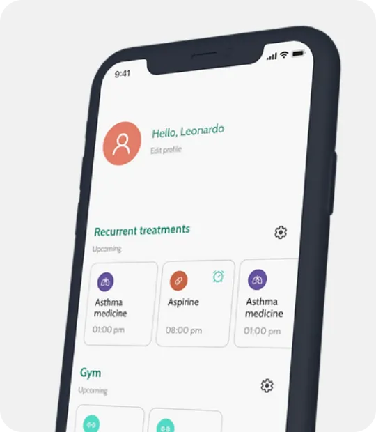
Enhanced Organization
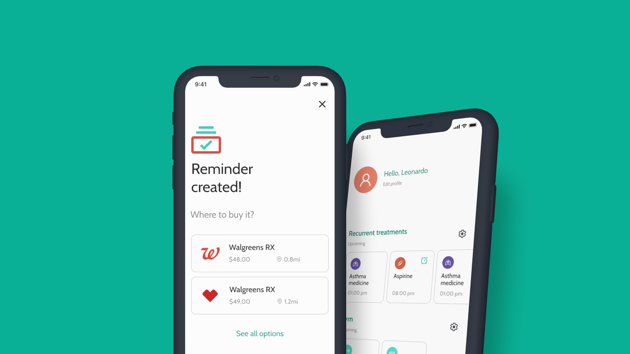
A dedicated section for recurring medications and customizable categories helps users organize treatments according to their daily routines.
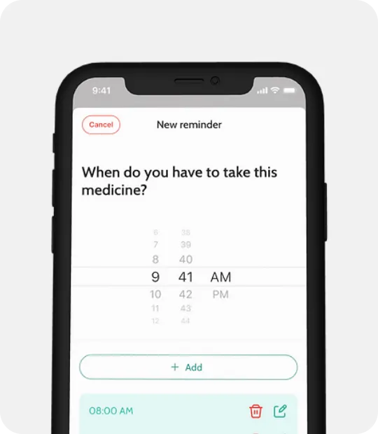
Enhanced Scheduling
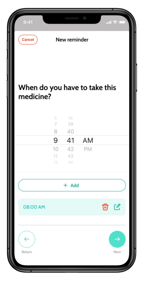
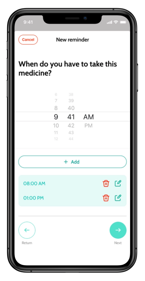
Users can add multiple reminders from a single screen or choose common dosage patterns such as "3 times per day," reducing repetitive setup.
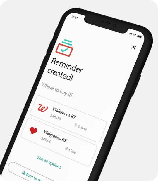
Smart Recommendations
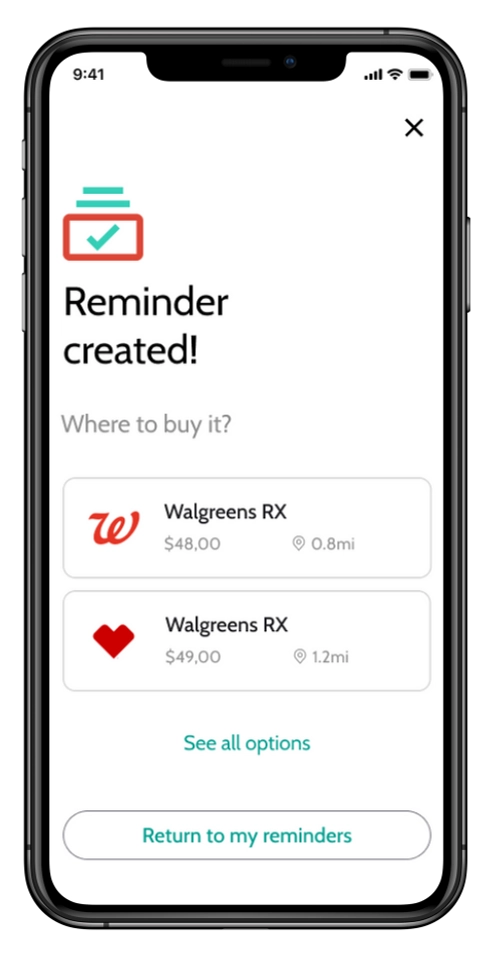
After creating a treatment, the app recommends nearby pharmacies where the medication is available, helping users complete the process without leaving the app.
Outcome
This project demonstrated how small interaction improvements can simplify an otherwise repetitive task. Rather than adding more features, the focus was on reducing friction throughout the medication management flow—from creating reminders to purchasing medication.
Learnings
Designing for healthcare reinforced the importance of clarity and flexibility. Different users follow different medication routines, making adaptable scheduling just as important as a simple interface.