Token Refactor
Strategy
Design System
Accessibility
Project
Over time, AEG’s color system had evolved without a clear structure. Colors were duplicated, tokens lacked meaning, and hardcoded values made updates risky and time-consuming.
Goals
- Create a semantic token system that scales across products and themes
- Reduce complexity by removing duplicate and unused values
- Achieve WCAG AA accessibility compliance
- Establish a foundation for future themes, including dark mode
Understanding the Current State
The first step was understanding how colors were actually being used across the product. The audit revealed:
- 80+ color tokens with overlapping values
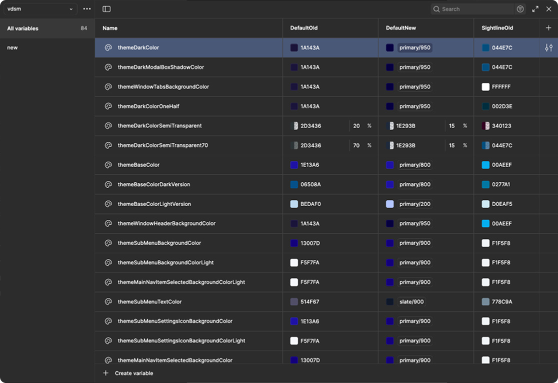
- Non-semantic naming (themeDarkColor, themeColorOneHalf)
- Hardcoded colors bypassing the token system
- No reliable structure for creating new themes
Rebuilding the Product Foundation
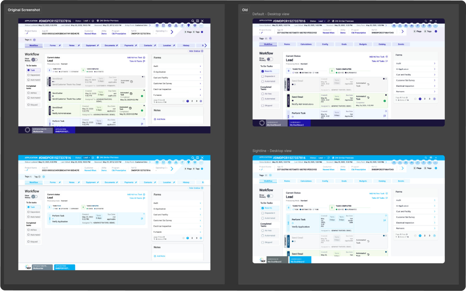
Because the existing product had no updated design source files, the interface was reconstructed in Figma to create a reliable testing environment.
Understanding Token Usage at Scale
Before introducing a new system, I mapped existing tokens across real product screens.
From Literal Colors to Semantic Tokens
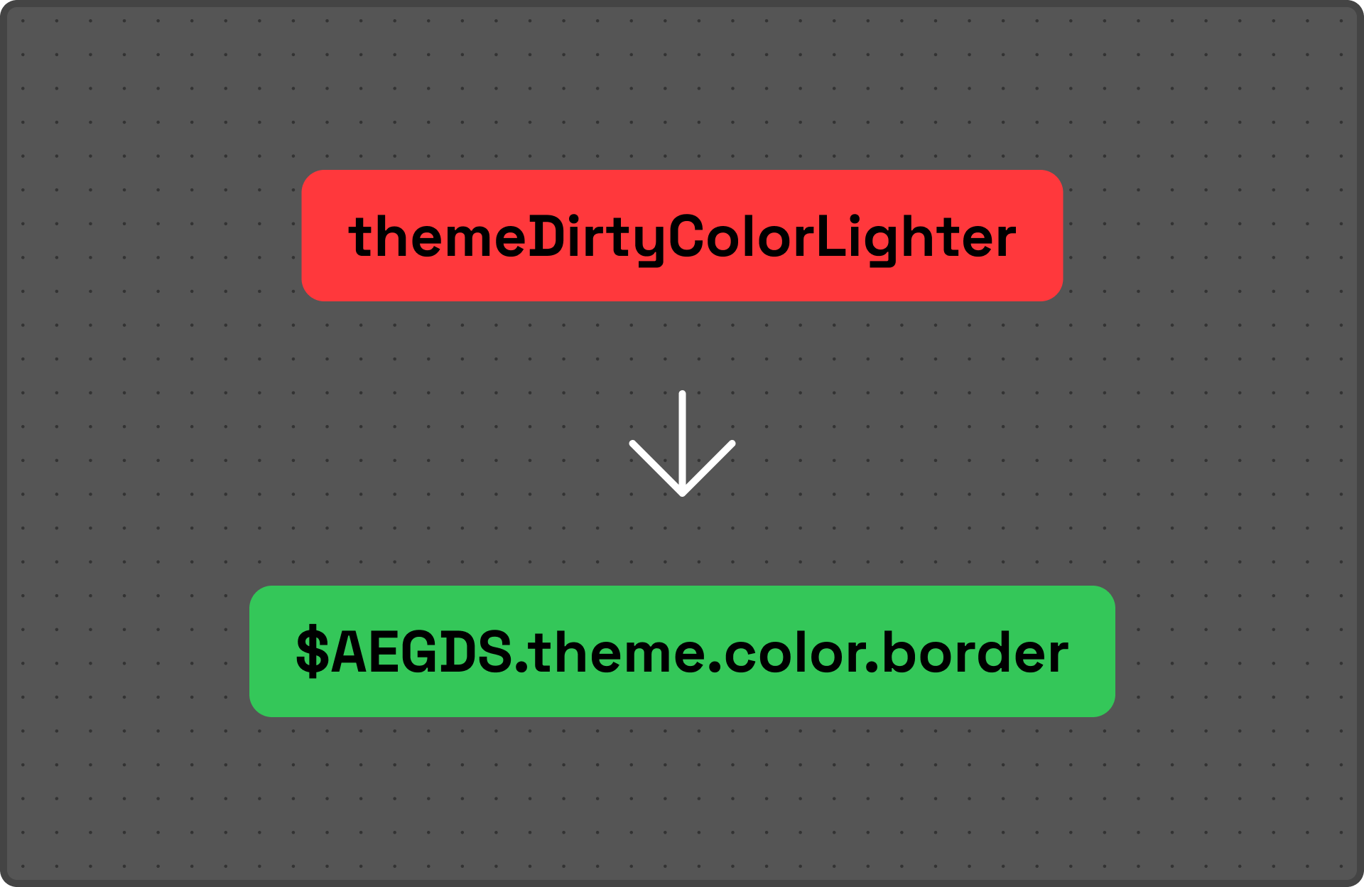
The previous system described colors by appearance rather than purpose.
Theme tokens
Colors that change depending on brand/theme.
Common tokens
Universal states such as: Success, Warning, Critical, Information
Reducing the Token List
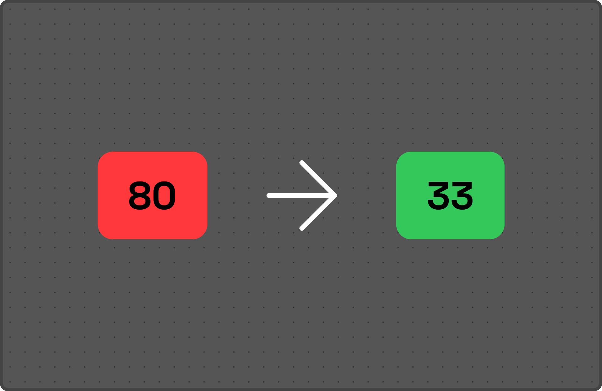
Through consolidation and removal of redundancies, the token list was significantly reduced. The system became easier to understand, maintain, and extend.
Designing for Accessibility
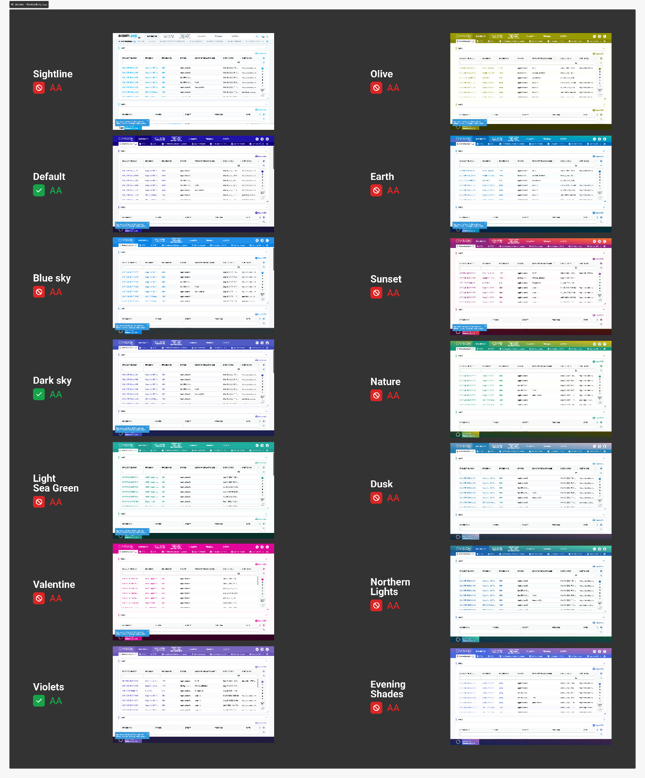
Accessibility was not treated as a final check—it became part of the token creation process. Each theme was reviewed against WCAG contrast requirements.
Initial audit:
Only 3 of 12 themes passed contrast checks
After refinement:
All themes achieved accessible contrast levels
Building a More Flexible Theming System
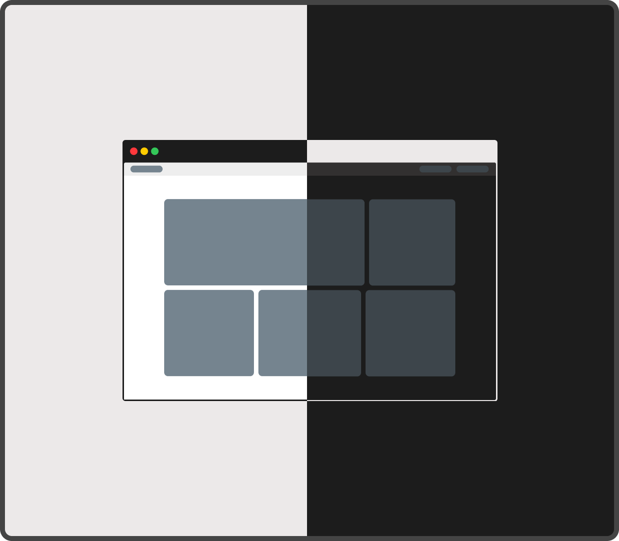
The previous token structure made dark mode difficult to maintain because colors were tied to specific values instead of usage. The new semantic approach allowed dark mode variations to be created by adjusting theme values instead of rebuilding components.
Impact

59% reduction in token complexity
Reduced the color system from 80 → 33 tokens, removing duplication and making usage clearer.

Faster theme creation
Previously, creating or adjusting themes required days of manual updates.With the new token architecture, themes could be configured in minutes.
Improved developer handoff
Tokens aligned with Tailwind conventions, reducing translation effort between design and development.

Accessibility built-in
All 12 themes were reviewed and updated to meet accessibility standards.